Branding with a Purpose
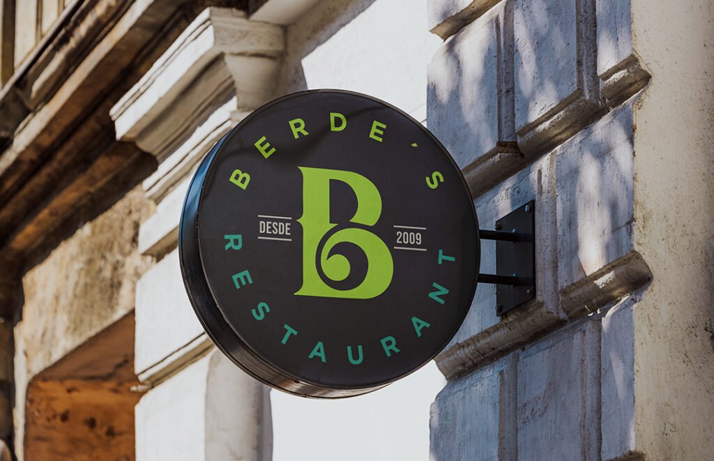
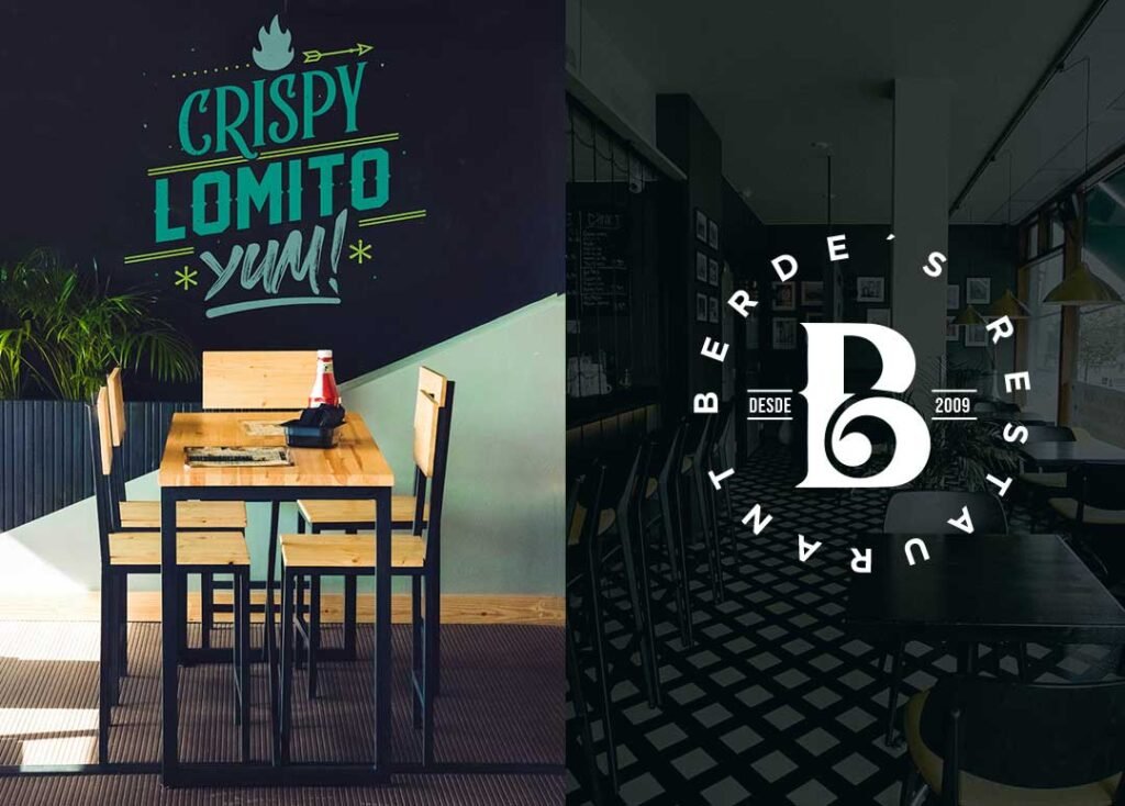
Berdes is a restaurant located in San Cristóbal, Venezuela. At first glance, the name might catch your eye—though it’s spelled with a B, not a V. That’s intentional: the B stands for bueno (good), while verdes (green) evokes freshness and quality.
The client wanted a brand that would communicate this concept clearly and creatively, both through the name and visually.
My role in this project was to develop a complete branding and visual identity for Berdes. The challenge was to translate the brand’s values—goodness, freshness, and high-quality ingredients—into tangible elements:
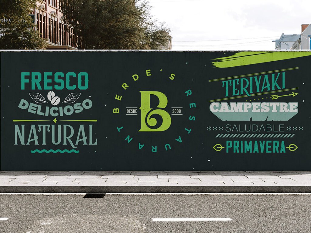
Lettering and decorative vinyls highlighting signature dishes, ingredients, and tourist spots from Venezuela.
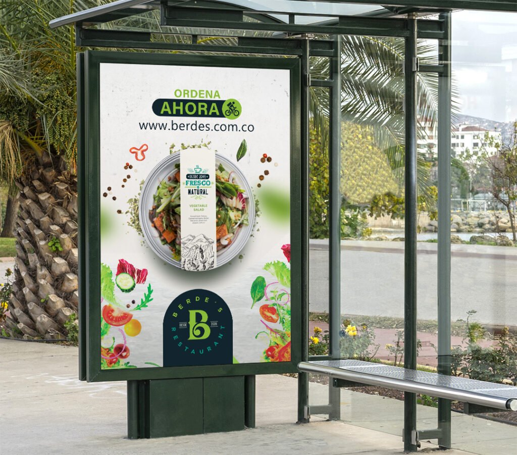
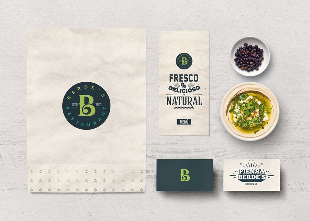
Menus, packaging, and take-away containers designed to extend the brand experience beyond the restaurant.
Logo, color palette, icons, and visual language that reinforce the concept across all touchpoints.
Berdes offers a wide variety of dishes, from fresh salads to premium meats and other specialties—celebrating quality and flavor in every plate.
The result was a cohesive, creative, and expressive identity that not only satisfied the client but also communicates Berdes’ mission: good food made with high-quality ingredients, presented with care and creativity.
Working on this project reminded me how branding is problem-solving—it’s about understanding the client’s goals and turning them into visual stories that connect with people.